Douglas
“What’s the matter Quinn?”
No response.
Five year old Quinn stared at the keyboard with a furrowed brow.
A happy voice from the computer: “You’re doing great! Eight… Nine… What comes next?”
Quinn's focus moved back and forth from keyboard to screen. A moment ago he was cruising through the ‘learn to count’ app. Now he was stuck, stopped cold.
Quinn knew how to count, well past twenty. And yet he was stuck at 10. The math teaching app was in beta, and I, his Uncle Doug (and designer of the app), was using some afternoon babysitting as an impromptu focus group.
“What's the matter Quinn?,” I tried again. “You look like you are thinking really hard. What are you trying to do?”
“I can’t find the key.”
“What key?”
“The ‘ten’ key.”
Interfaces fail when designers fail to anticipate the needs of the user. This app failed not in teaching Quinn to count, but in anticipating his understanding of a typing, and that typing a ‘1’ followed by a ‘0’ indicates a ten.
User interface designers cannot predict every need of their users. But they can avoid the worst missteps through empathy. Think not: “what would I do in this situation”, but instead: “What would the user do?” It can be tempting to conflate one’s own experience with that of a user. Great UI designers step outside of their own experience and learn to see and feel anew with each project.
How do you design a great app?
At Germinate, we apply Human-Centered Design at every step of an app project, and especially when designing a user interface. Human-Centered Design principles point the practitioner to the way a human might experience a system, and to the outcome that system may provide for the humans involved. Simple. But not easy. It takes the right balance of empathy and decisiveness to get things right.
There are great resources out there to get you started on Human Centered Design. One of our favorites is the LUMA Institute.
Along our journey applying human-centered design, we’ve discovered a few tips:
Be Curious, Stay Curious. The mental state of curiosity opens the mind to receive new information AND new perspectives. Asking questions, wondering “What if” and exploring without assumption helps filter the insights from the noise.
In particular, stay curious about the people that will use your app:
Who is the user? How much do you know about your user? How specific can you get about who they are?
What are they trying to do? What do they care about? How will your app help them reach their goal?
What is the state of their world? Are they late for school? About to head into a sales call? Did they wait too long to order dinner and now are starving? Did they just wake up, or is sleep nowhere in sight? Are they excited, filled with hope and joy? How will your app change affect their state of mind?
And only then, what do you want them to do? Is that goal connected to what the user wants? How can the app align their interests with yours?
Make your users awesome. We’re big fans of Kathy Sierra. When an app makes heroes of its users, they will shout it to the rooftop. Make the experience personal to your user, help them be awesome and badass. Kathy says it better than we ever could here.
Paint a picture of success. What does success look like for your user? Tell their story as if you were a scriptwriter. Try using action language, knocking out abstracted terms and ‘thought verbs.’ Use only actions and direct descriptions. Instead of ‘The user is delighted to see their driver arrived right on time’ Try “A smile broke out across Dan’s face, his first of the day. His ride pulled up at his feet and the driver was already at his side to stow his bag in the trunk”
Painting a vivid picture of customer success helps everyone involved in creating and launching your app stay pointed toward the things that matter.
Ship it! Observe, then ship it again! Focus groups have their place, and can be a great tool when stakes are high or the needs of the users feels too abstract. But be careful the difference between Voice Of The Customer and ACTION of the Customer. The action is where you want to be. Too often focus groups use inert pictures, and all you get back is ‘voice’, no action. When looking at pictures of an app and asked about functionality, there can exist a pressure to provide feedback that produces lots of input but very little insight.
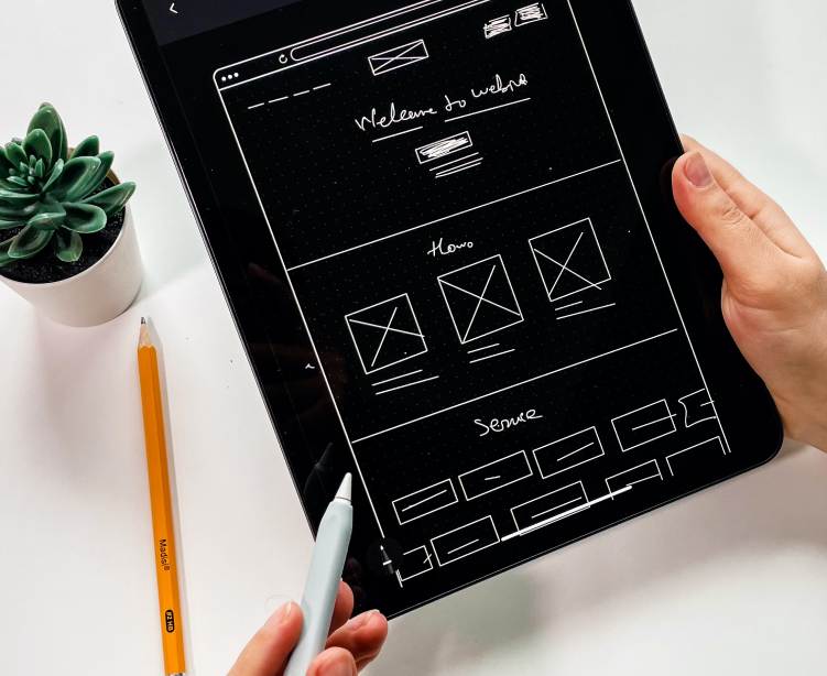
Challenging a focus group to actually use an app, and then asking them how they did it and how it felt, can cut quickly to the insight that will make your app better. A rough but real prototype is often preferable to wireframes when user testing is needed.
From the Mind's Eye to the Eye of the Beholder
Oftentimes, the folks we work with have a clear picture in their mind of what they want their app to do. We’ve found that human centered design is a useful way to get those ideas out of the mind and into the world. The app in real life is rarely the same as the original idea, and that is part of what makes the process so exciting.


